Web CTA
Date created May 13, 2021
In the world of all things online, it’s a never-ending learning curve for many to explore the best possibilities to benefit oneself — be it from marketing your brand on social media platforms, talking to another colleague across the pacific ocean in real time via Skype, or even stream your favourite Sherlock TV series on Netflix.
But what if you’re a driven entrepreneur looking at building your first website to get your brand out there? Sometimes, a website alone isn’t good enough; or let alone, one that’s beautifully-designed but lacking vital CTA functions. But wait a minute, what’s a CTA?
CTA stands for Call To Action. It’s technically a link embedded into a button on a website that directs web visitors to explore further. They can direct users to a page displaying about a company’s information, visiting an integral part of a website, or could even translate to sales or enquiries depending on how it’s designed by the webmaster itself.
Also, CTAs do enhance the click-through rate of one’s website by engaging users to visit other sections beyond the homepage. This is a great way to further elevate your website’s presence on any search engine; consecutively helping your site to tap into its SEO potential.
So, is there a way to create good CTAs in a bid to attract web page visitors by redirecting them to another part of a website that’s deemed important? Here are three simple tips:
1. Give it an attractive outlook.
The goal here is to draw attention, and the best way forward is to place your CTA(s) in a prominent location within your website. However, placement flow also plays a vital role here because you wouldn’t want to place a CTA before any intended product or informative description. Secondly, do inject some pizazz (e.g., a bolder outline or a subtle but attractive appearance) to draw attention!
2. Use a fitting line of text.
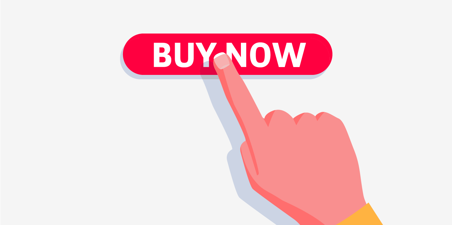
Texts used on CTAs doesn’t need to be long; in fact, the shorter it is, the more effective it gets. Examples like “Buy Now”, “Speak To Us”, “Reserve Your Spot, or even “Click Here” does the job well enough. What’s important, though, is by connecting the text used on your CTA to relate with the intended product, service, promotion and etcetera to maximise effectivity. Let’s say if you’re selling online tickets with a promo thrown in for a limited time, then your CTA should write “Book Now!” to raise the likelihood of your webpage’s visitors to take action.
3. Make sure it stands out.
Common mistakes most websites make are sandwiching CTA(s) alongside sizeable images or design elements. This results in a rather ununiformed layout, of which could lead viewers to simply leave the site due to confusion. To avoid this, maintain a white space around the CTA button to create a visual break to truly reflect its core function!
< View All Posts


